
 By Alex Morgan
My Experience:
When was the last time you looked at a blank page and felt relief rather than anxiety?
For most of us, the answer is “rarely.” We live in a culture that treats white space as waste. There is no empty calendar slot we won’t fill, no quiet moment we won’t optimize, and no neutral outfit we won’t accessorize until it screams.
So when Pantone—the global authority on color trends—announced that its 2026 Color of the Year is Cloud Dancer (PANTONE 11-4201), a soft, billowy white with the faintest blush of warmth, the internet did what it does best: it split in half. Some called it a “recession indicator.” Others called it “boring.” A few called it exactly what we needed.
Here’s the thing most people missed: Cloud Dancer isn’t about blandness. It’s about structure. Pantone describes it as “a key structural color whose versatility provides scaffolding for the color spectrum, allowing all colors to shine”. In other words, this isn’t an absence of color. It’s the foundation that makes every other color make sense.
This article will unpack what Cloud Dancer actually is, why it matters beyond fashion week, how to use it across interiors, wardrobes, branding, and personal wellness—and what it reveals about where we’re headed as a culture.
What Exactly Is Cloud Dancer? The Color, Not the Myth
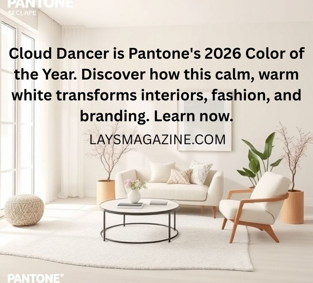
Let’s clear something up immediately: Cloud Dancer is not “just white.” It’s a warm, creamy, balanced white that sits between stark optical white and yellow-toned cream. Pantone’s official description calls it “a lofty white that reads like a breath of fresh air and is imbued with a feeling of serenity”.
The Technical Identity
-
Pantone Code: 11-4201 TCX
-
Undertones: Pearl, violet, and beige
-
Temperature: Balanced—neither cool nor overtly warm
-
Saturation: Extremely low, but not zero
Unlike the icy whites of minimalist design’s past, Cloud Dancer has a fleshy warmth that makes it feel lived-in rather than clinical. Vogue Australia noted that it “evolves our desire for contentment and harmony and the feeling of peace, unity, and cohesiveness”. That’s a tall order for a paint swatch, but the logic holds.
Why Pantone Chose White Now
Pantone’s Color of the Year isn’t a prediction. It’s a diagnosis. The Color Institute reads cultural signals—from film and fashion to politics and technology—and identifies the emotional temperature of the moment. Laurie Pressman, Vice President of the Pantone Color Institute, explained that “similar to a blank canvas, Cloud Dancer signifies our desire for a fresh start”.
The previous years tell the story:
-
2023 (Viva Magenta): Defiant, loud, post-pandemic rage
-
2024 (Peach Fuzz): Nurturing, soft, healing
-
2025 (Mocha Mousse): Grounded, earthy, comforting
-
2026 (Cloud Dancer): Clear, quiet, reset
The trajectory is unmistakable: we’ve moved from reaction to reflection. Cloud Dancer is the color of a culture that’s tired of performing.
The Psychology and Symbolism of White
White carries more cultural baggage than any other color. Western culture reads white as purity, cleanliness, and new beginnings; Eastern traditions associate it with mourning and transition; design treats it as space, possibility, and silence.
Cloud Dancer sits at a crossroads of meanings:
-
Freshness without coldness: Unlike stark white, it doesn’t feel sterile.
-
Calm without passivity: It’s quiet, but it’s not empty.
-
Neutrality without erasure: It doesn’t erase other colors—it amplifies them.
Pantone explicitly frames it as “a symbol of calming influence in a society rediscovering the value of quiet reflection”. The phrase “rediscovering” is doing heavy lifting here. We didn’t lose the value of quiet; we actively traded it for noise. Cloud Dancer is the bill for that trade.
Cloud Dancer Across Domains: Where the Color Lives
Interior Design: The “Soft Minimalism” Shift
Cloud Dancer is arguably most at home in interior spaces. Designers are already calling it the antidote to the “Instagram-maximalism” fatigue. Mansion Global reported that the hue “signals a shift toward soft minimalism”.
How to use it well:
-
Walls: Color-wash an entire room for a cocooning effect, or use it as trim and ceiling color against a deeper wall tone.
-
Textiles: Voile curtains, linen slipcovers, boucle seating—anything that catches light and moves.
-
Layering: Pair with natural materials like wood, stone, and unbleached cotton. The warmth of Cloud Dancer prevents the “sterile gallery” look that plagues other whites.
-
Accents: Let it serve as the canvas. A single saturated piece—a rust velvet chair, a deep olive ceramic—becomes a focal point rather than noise.
Interior designer Helen Green notes that Cloud Dancer “reflects a growing desire for calm, clarity and longevity in interior design”. This isn’t about following a trend. It’s about future-proofing a space.
Fashion: The Quiet Power Move
The Spring/Summer 2026 runways were saturated with milky whites, and Cloud Dancer became the shorthand for that palette. Who What Wear described the shade as “billowy milky hues that ruled on the S/S 26 runways”.
Ways to wear it:
-
Head-to-toe monochrome: A Cloud Dancer suit or dress reads as intentional and polished, not boring—especially when texture does the talking.
-
Layering piece: A Cloud Dancer blazer or trench elevates denim, olive, or black without competing.
-
Beauty: Hair colorists are already using it as a reference for cleaner blondes and grey blending. Manicurists are calling it the “perfect color to welcome in 2026”.
The key insight: Cloud Dancer flatters skin tone because of its balanced undertones. It’s not a shade that wears you; it’s a shade that lets you wear it.
Branding and Graphic Design
For businesses, Cloud Dancer offers something rare: clarity without aggression. VistaPrint’s design team recommends using it as “a grounding base or accent color in marketing materials for a clear, modern and calm look”.
Where it works best:
-
Wellness and healthcare brands: It communicates cleanliness without clinical coldness.
-
Luxury and hospitality: It signals quiet confidence rather than ostentatious wealth.
-
Tech and SaaS: It provides breathing room in interfaces and decks that are otherwise dense with information.
-
Packaging: It photographs beautifully and reduces visual noise on shelves.
Where it fails: Brands that need to convey urgency, disruption, or high energy. Cloud Dancer doesn’t shout. If your brand strategy requires shouting, this isn’t your color.
Practical Tips: How to Actually Use Cloud Dancer (Without It Looking Bland)
The most common mistake with any white is treating it as a default rather than a decision. Cloud Dancer requires intention. Here’s how to make it work.
1. Contrast Is Non-Negotiable
White only reads as “white” when there’s something near it that isn’t. Pair Cloud Dancer with:
-
Deep tones: Charcoal, espresso, forest green, navy
-
Warm metallics: Aged brass, bronze, unlacquered copper
-
Natural textures: Raw wood grain, rattan, unpolished stone
2. Texture Over Color
In a Cloud Dancer-dominant space or outfit, texture becomes the primary storyteller. Boucle against linen. Smooth ceramic against rough plaster. Satin against wool. The eye needs variation, even when the palette is monochrome.
3. Lighting Matters More Than Paint
Cloud Dancer shifts with light. North-facing rooms will pull it cooler; south-facing rooms will pull it warmer. Test it in your actual space before committing. Paint large swatches on multiple walls and observe them at different times of day.
4. Don’t Over-Edit
The temptation with white is to keep removing things until the space feels “clean.” But Cloud Dancer thrives with warm, imperfect, human elements. A stack of books. A worn leather chair. A single stem in a ceramic vase. The color is a canvas, not a cage.
Common Mistakes and How to Avoid Them
Mistake #1: Assuming “Neutral” Means “Safe”
Cloud Dancer is neutral in color, but it’s not neutral in effect. It draws attention to whatever it touches—whether that’s a poorly finished wall, a stained fabric, or a design that lacks structure. Use it as a spotlight, not a cover-up.
Solution: Before committing to Cloud Dancer, audit the elements around it. If something is low-quality or poorly maintained, the white will expose it.
Mistake #2: Pairing It with Stark White
Cloud Dancer next to pure optical white looks dirty, not layered. The two whites fight each other.
Solution: Pair Cloud Dancer with off-whites that share its warmth, or with colors that provide clear contrast. Avoid the “two whites” trap.
Mistake #3: Using It in High-Traffic, High-Mess Areas Without Protection
White upholstery, white flooring, white walls in a home with toddlers and pets? That’s not calm. That’s anxiety waiting to happen.
Solution: Use Cloud Dancer in low-touch zones—ceilings, upper walls, accent furniture—or invest in performance fabrics and washable finishes.
Mistake #4: Treating It as a Trend Rather Than a Foundation
Cloud Dancer isn’t a flash-in-the-pan shade. It’s designed to function as a structural neutral that outlasts trend cycles.
Solution: Use it in elements you’re not planning to replace every two years: tile, cabinetry, core wardrobe pieces, brand identity systems.
Pros, Cons, and a Balanced Verdict
Pros
-
Versatility: Works across interiors, fashion, branding, and beauty.
-
Emotional resonance: Aligns with a cultural moment that values calm over chaos.
-
Timeless potential: As a structural neutral, it has a longer shelf life than trend-driven hues.
-
Light-enhancing: Reflects light without glare, making spaces feel larger and airier.
Cons
-
High maintenance in practical applications: White shows every smudge, stain, and scuff.
-
Can read as “unfinished” without intentional layering.
-
Not a differentiator: If everyone uses Cloud Dancer, it stops being a statement.
-
Cultural mismatch: In some contexts, white carries associations that may conflict with brand or personal identity.
The Verdict
Cloud Dancer is not for everyone, and that’s the point. It’s a color that asks you to slow down, edit ruthlessly, and trust that less can be more. If your life or brand is built on noise, this will feel like a straitjacket. If you’re craving clarity, it might be the most powerful choice you make this year.
Future Trends: What Cloud Dancer Signals for 2026 and Beyond
The “Quiet Luxury” Continuum
Cloud Dancer extends the quiet luxury movement that dominated 2023–2025. But it pushes further: where quiet luxury was about what you don’t say, Cloud Dancer is about what you don’t need to say. It’s the aesthetic equivalent of a deep breath.
Expect to see:
-
Cloud Dancer in tech: Minimalist interfaces, white-label SaaS platforms, and hardware design that prioritizes calm over flash.
-
Cloud Dancer in wellness: Spas, meditation apps, and healthcare environments using it as a baseline.
-
Cloud Dancer in fashion: Continued runway presence, but also resale value—neutral whites hold their worth longer than seasonal colors.
The Recession Indicator Debate
Some commentators have called Cloud Dancer a “recession indicator”—the idea that when economies tighten, color palettes go quiet. The Guardian’s fashion critic noted that Cloud Dancer “represents a more sustainable choice for the eco-conscious”, which is a polite way of saying: buy less, buy better, buy things that last.
Is that a recession signal? Or is it a maturity signal? The distinction matters. A recession indicator implies fear. A maturity signal implies agency. Cloud Dancer leans toward the latter.
The Anti-Maximalist Correction
We’ve spent the last five years in a maximalist cycle: dopamine dressing, bold interiors, saturated branding. Cloud Dancer is the correction, not the rejection. It doesn’t say “no” to color. It says “not yet.” It’s the pause between sentences, the rest between notes.
Key Takeaways
-
Cloud Dancer (PANTONE 11-4201) is Pantone’s 2026 Color of the Year—the first near-white to take the honor.
-
It’s a warm, balanced white with pearl, violet, and beige undertones, designed as a structural neutral.
-
Its cultural message is reset, clarity, and quiet reflection, not blandness.
-
It works across interiors, fashion, branding, beauty, and wellness, but requires intentional contrast and texture.
-
Common mistakes: treating it as safe, pairing it with stark white, and using it in high-maintenance applications without protection.
-
Future outlook: Cloud Dancer signals a shift toward soft minimalism and longevity-driven design, not a retreat from color.
Frequently Asked Questions
What is Cloud Dancer?
Cloud Dancer is Pantone’s Color of the Year for 2026. It’s a soft, warm white (PANTONE 11-4201) described as “a lofty white that reads like a breath of fresh air”.
Is Cloud Dancer just white?
No. It’s a specific shade of white with warm undertones—pearl, violet, and beige. It sits between stark optical white and yellow-toned cream.
How do I use Cloud Dancer in my home?
Use it as a wall color, trim color, or foundation for textiles. Pair it with deep tones, natural materials, and varied textures. Test it in your lighting before committing.
Is Cloud Dancer a good color for branding?
Yes, if your brand values clarity, calm, and modern minimalism. It works well for wellness, hospitality, tech, and luxury brands. It’s less effective for brands that need urgency or disruption.
Will Cloud Dancer go out of style quickly?
Because it’s a structural neutral rather than a trend color, it has a longer shelf life than saturated hues. Its “timelessness” depends on how it’s used—as a foundation, not a statement.
What colors pair well with Cloud Dancer?
Charcoal, espresso, forest green, navy, aged brass, bronze, and natural wood tones. For softer palettes, pair with powdered pastels.
Is Cloud Dancer the same as “off-white”?
Not exactly. Off-white is a broad category. Cloud Dancer is a specific, balanced white with defined undertones and a Pantone code. It’s more intentional than generic off-white.
Sources
-
Pantone Color Institute, official 2026 Color of the Year announcement
-
CNN, “Pantone names its Color of the Year for 2026”
-
The Guardian, “A minimalist statement or just Pantonedeaf?”
-
Vogue Australia, “The 2026 Pantone colour is ‘cloud dancer'”
-
Mansion Global, “Design Pros Weigh in on Pantone’s Color of the Year”
-
Who What Wear, “I’m Giving My Wardrobe an Elegant Upgrade”
-
VistaPrint, “Pantone Color of the Year 2026: Everything you need to know”
-
Helen Green Design, “Neutral Doesn’t Mean Boring”